Helping Doctap reimagine their doctor appointment booking process.
Role / User Research, Product Strategy, UI Design, Interaction Design, Usability Testing
Tools / Figjam, Figma, Maze, ChatGPT, Slack
Timeline / 4 weeks
Company / Doctap
The Goal
Doctap's goal is to enhance their online same-day doctor's appointment booking process, catering specifically to professionals seeking a fast and convenient way to book a consultation with easy and reliable service for immediate medical attention.
The Challenge
The outdated UI and inconsistent design create a lack of confidence among users, leading to potential user disengagement and a low booking conversion rate.
Overall cumbersome booking process, resulting in user dissatisfaction and distrust.
Currently only available on the desktop Web app, with limited cross-device availability.


Metrics
The metrics listed below were metrics we knew could be easily conducted, and would have the most impact in helping us gain insights into the success of our designs.
Booking Conversion Rate - The percentage of users who initiate the booking process and complete it.
Average Booking Time - The average time it takes a user to complete the booking process, including all steps from searching for a doctor to confirming the appointment.
User satisfaction - The level of satisfaction of users with the booking experience, as measured through surveys and feedback mechanisms.
The Process
Discovery
Learn about the state of online same-day doctor appointment flow. What’s the biggest concern of user?
Define
What possible solutions exist, and where do we fit within those markets and boundaries?
Ideate
How can we bring a realistic and competitive design? How do we deliver a best in class experience to our customers.
Design
Collaborate and advocate design solutions that provides the best user experience.
Testing + Outcome
How and where our design is successful and learn from user’s responses.
Discovery-Competitor Benchmarking
To better understand both business requirements and market positioning, we conducted comprehensive competitive benchmarking, evaluating both direct and indirect competitors within the online same-day healthcare industry.
User Interviews
In parallel to our competitor benchmarking, we conducted 8 in-depth user interviews in order to better understand users pain points and their overall experience with online doctor booking processes. From this, we extracted qualitative data revealing crucial insights and user frustrations essential to informing our design process.
Business & User frustrations
Through our research we found that the outdated UI and inconsistent design create a lack of confidence among users, leading to potential user disengagement and low booking conversion rate. We found that the two highest priority frustrations were:
Primary Frustration (Business): Doctap's platform suffers from outdated design, usability issues, limited cross-device availability, inconsistent branding, and a lack of professionalism, putting them at a competitive disadvantage in the market.
Secondary Frustration (User): The user faces challenges in locating real-time appointments, inaccurate pricing, difficulty in narrowing down to the right medical issue, and a overall cumbersome booking process, resulting in user dissatisfaction and distrust.
Define-Problem Space
Users face usability challenges in booking appointments efficiently on Doctap due to difficulties in finding suitable time slots, misleading button labeling and content, limited control over editing selections, and a lack of transparency in doctor credentials and specialization.
How might we...?
How might we streamline Doctap’s appointment booking process and level up their visual design to create a trustworthy, professional and desirable experience to keep the company highly competitive in the market?
Ideate-Ideation
Our ideation process, characterized by collaborative sketch and design review sessions, emphasizes compromise, high-fidelity solution definition, visual pattern utilization, competitor benchmarking integration, and iterative refinement for optimal design outcomes.

User Interviews
In parallel to our competitor benchmarking, we conducted 8 in-depth user interviews in order to better understand users pain points and their overall experience with online doctor booking processes. From this, we extracted qualitative data revealing crucial insights and user frustrations essential to informing our design process.
Visual Inspiration
Following Competitor Benchmarking, we knew Doctap needed to level up their visual design. We took inspiration from successful med-tech platforms such as ZocDoc, Qured, and Carbon Health. The usage of colors, patterns, and imagery from their visual design assisted in conveying Doctap’s branding in appearing trustworthy, professional and reliable.

Crazy 8's
We used a Crazy 8 workshop to accelerate ideation, generating diverse ideas through rapid sketching; afterward, we refined and iterated on promising concepts based on feedback, documenting selected ideas to guide and prioritize the subsequent design process.
User Flow Diagrams
We began mapping the existing user flows to identify and understand the booking process flaws. We improved the user flow by restructuring it in ways that aligned better with user behavior and standard booking flow.
What we can add…
Implement a search bar with predictive search, smart filters, and transparent pricing for streamlined and user-friendly doctor and location selection.
Offer flexible confirmation/notification options for user preferences.
Rapid Sketching Session

What we can improve…
Enable editable appointment summaries for flexibility.
Use user-centric language to align with user expectations and convey intended actions.
Optimize space utilization with a responsive map reflecting user location.
We utilized rapid sketching sessions to foster creativity and address early challenges, ensuring valuable insights, saving time, preventing errors, and establishing a robust foundation for creating detailed high-fidelity prototyping in the next stage.

Design-Design
After establishing a design system of components to develop a consistent design language, we worked as individual contributors as we split the booking process in three parts:
Select Medical Care and Location
Search & Filter for Preference and Specialization
Registration & Login, Appointment Detail, Payment Method & Confirmation
We built the final high-fidelity prototype in parallel sprints, utilizing Slack, Figma comments and design review sessions to effectively communicate updates and iterations.

Styles and Components
Prior to high-fidelity designs, our team focused on defining components, font styles, and color schemes to ensure a cohesive visual identity.
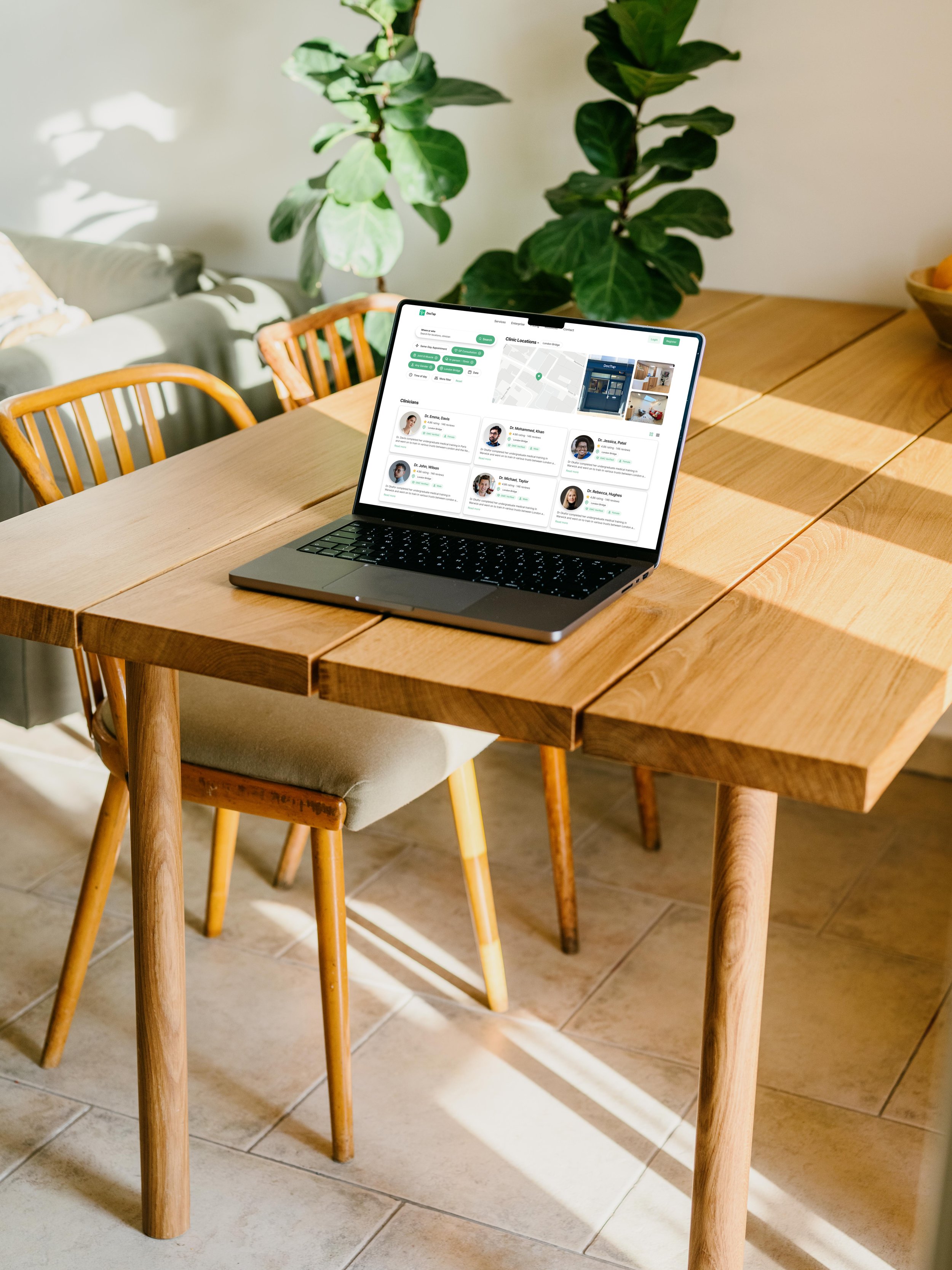
High Fidelity Prototype

As a final design step, we put together all the high-fidelity wireframes and interactions for a fully functioning prototype which you can see below…
Testing & Outcome-Usability Testing
To test our high-fidelity prototype, we utilized Maze, in order to conduct unmoderated testing.

Test Outcomes
Having tested the prototype, based on the user behavior observed within the heat map and clicks, users effectively utilized the designed features— Buttons to select and de-select; reset to clear preferences. Validating our success in providing enhanced freedom and control.
Key Learnings
UX Content + Accessibility:
Users were confused by the inconsistent CTA labeling in the login process, causing them to deviate from the intended path by selecting ‘Sign in’ instead of ‘Sign Up’, highlighting the need for clearer and consistent UX Content.
Users reported skimming through the UX content and the supporting description text sizes could be increased for improved legibility, emphasizing the need to condense the amount of text information for better comprehension.
The toggle design wasn’t successful...🙃
Wasn’t as visible which may have caused it to be overlooked, even though it was placed as the first filter within the menu.
The toggle was visually different from the rest of the design which may have caused a disconnection to the rest of the filter menu, and based on user behavior, users naturally understood the selecting and deselecting of buttons design.
The selections within the filters could be enhanced if we were to organize them alphabetically, this reduces time spent on finding desired selections, potentially shortening the average booking time.
We discovered that returning patients desired some of their preferences to be saved as default so that they don’t have to reselect the same preferences each time.
Next Steps
Change the CTA label to ‘Log In’ rather than ‘Sign In’ for clearer and consistent UX content condense the amount of supporting UX Content and increase text sizes for better legibility and comprehension.
Replace the Same-day appointment toggle design for the button design aligning with the rest of the design components.
Organize the selections within each filter alphabetically, to help users reduce time spent on finding desired selections.
Preferences such as clinician gender, clinic location, in person/telephone appointment and appointment time could be saved as default for returning users. This could be built in as a shortcut to the Log In process as well as user profiles.